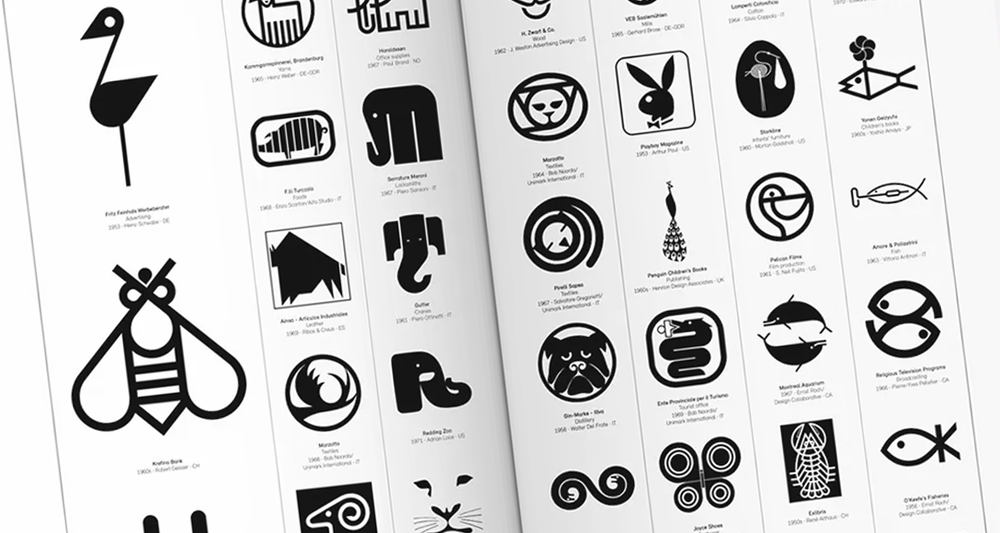
Simplicity in design is the ultimate sophistication

Think of the most iconic brands. What do they have in common?
They have one, simple, easy to remember message. They focus on one thing, and they do it well. They embrace the power of simplicity.
But time after time, after time, we see brands making design solutions far more complex than they need to be.
For many companies the FOLO (Fear of Leaving Out) is real – they’re so scared to miss anything vital out, that they include far too much. And that can really cause a problem, for design, messaging, marketing branding…the works.
It’s a battle. And a daily one. We spend hours upon hours trying to convince clients that they don’t need to include every single scrap of information about their business in their email signature, or their bio, or anywhere really.
So what do we mean by simplicity?
In the spirit of simplicity, let’s get back to basics – what is simplicity? Firstly, we need to point out that simplicity is not simple. It’s also not about minimalism. And it’s got nothing to do with Marie Kondo.
It’s about striping everything back to basics, removing anything unnecessary or complex, and focusing on what’s important. It’s about being human, relatable, and memorable.
Thinking of adding just another message or a few extra details? STOP! You don’t need them! Remember what our old friend Leo da Vinci said: “Simplicity is the ultimate sophistication”.
Why are we so scared of simplicity?
As Confucius said, “Life is simple. It’s people who make it complicated.” And boy, can we make it complicated! But why? Why can’t we be happy with simple?
The curse of knowledge
Businesses are too close to the subject. They’re aware of the curse of knowledge and, in a bid to ensure their audience understands the concept, they end up over-compensating and providing far too much information, in far too much depth, just to be sure that they are properly understood.
In reality, of course, this typically has the opposite effect.
Complexity bias
This is the belief that complex solutions are better than simple ones. If something is simple and easy, it can’t be right. If it isn’t complex, people won’t believe in it, right?
But buzzwords, jargon, all those unnecessary complexities just confuse everyone. They don’t add to the message, they dilute it and confuse it.
Cognitive bias
It is engrained into us, as humans, that complexity outperforms simplicity. Again, not true!
So how do we achieve simplicity?
Achieving simplicity is complex, but it’s certainly not impossible. You just need to approach it in the right way. Here goes…
Start with everything you can think of – throw it all in there! The more info the better.
Got everything?
Now slowly start to remove elements, one at a time, until you’re left with the single most important message/purpose/solution. Focus on that one remaining element. Everything else is backup – it doesn’t get the limelight.
That’s simplicity.
Check out our podcast to hear more about our battle for simplicity.


